
Parallax Hero
Scroll the page to see a static background parallax effect in action.
Scroll-Triggered Video
As you scroll, the background video fades in for dynamic storytelling.
Auto-Zoom Hero
The background slowly zooms for dramatic effect without reacting to scroll.
Hero
Function: top-of-page call to action.
Tech Specs: styled in scss/components/_hero.scss.
Implementation:
<section class="hero">...</section>Banner
Function: promotional callout with image and link.
Tech Specs: styled in scss/components/_banner.scss.
Implementation:
<section class="banner">...</section>Book Details Wrapper

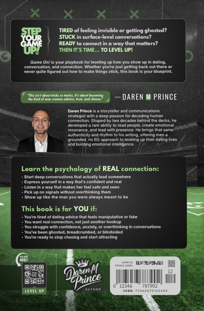
Your move.
Select a format.
No gimmicks. No games. Just practical dating psychology you can use today.
- What it does: Gives you a real-world roadmap to build magnetic, authentic connection.
- How it helps: Step-by-step guidance for approaching confidently, flirting naturally, and communicating clearly.
- Where it applies: Works for both dating apps and in-person interactions.
- Bonus tools: Daily connection rituals, a 30-day confidence challenge, and conflict-resolution frameworks.
- Overthinkers: Men who want to get out of their head and into confident action.
- Frustrated daters: Anyone tired of ghosting, mixed signals, and low-quality conversations.
- Growth-focused men: Readers ready to level up confidence and attract high-value relationships.
- Connection builders: People who want lasting communication skills, not short-term tricks.
| ISBN-13 | 9798303844407 |
|---|---|
| ISBN-10 | 9798303844407 |
| Publisher | Independently Published |
| Publish Date | December 2024 |
| Dimensions | 9 x 6 x 0.54 inches |
| Shipping Weight | 0.77 pounds |
| Page Count | 258 |
Book Details Wrapper
Function: interactive book preview with purchase options.
Tech Specs: styles in scss/components/_book-details-wrapper.scss, JS in js/book-details.js.
Implementation:
<section class="book-section">...</section>📘 Book Details Tabs

This book is a no-nonsense guide to modern dating for emotionally intelligent men who are done with gimmicks and ready for real results...
| ISBN-13 | 9798303844407 |
|---|---|
| ISBN-10 | 9798303844407 |
| Publisher | Independently Published |
| Publish Date | December 2024 |
| Dimensions | 9 x 6 x 0.54 inches |
| Shipping Weight | 0.77 pounds |
| Page Count | 258 |
This exclusive content is available to members only.
Book Tabs
Function: tabbed interface for preview, description, trailer, and members area.
Tech Specs: styles in scss/components/_book-tabs.scss, JS in js/book-tabs.js.
Implementation:
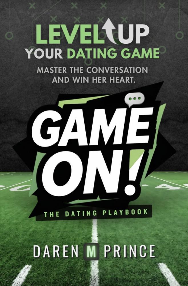
<section id="book-tabs">...</section>Book Cover
Function: static 3D book render.
Tech Specs: styles in scss/components/_book.scss.
Implementation:
<div class="book-preview"><div class="book-3d"><img src="cover.jpg" alt="Book cover"></div></div>Testimonials
"A must-read!"- Alex
"Truly inspiring."- Casey
"Eye-opening and real."- Jordan
Testimonials
Function: display user quotes in cards.
Tech Specs: styles in scss/components/_testimonials.scss.
Implementation:
<section id="testimonials">...</section>Downloads
Function: card grid for PDF or media downloads.
Tech Specs: styles in scss/components/_downloads.scss.
Implementation:
<section id="downloads">...</section>Viewer
Viewer
Function: embeds a document with simple toolbar.
Tech Specs: styles in scss/components/_viewer.scss.
Implementation:
<section id="viewer">...</section>
3D Book Viewer
Function: interactive book with inertia and lighting.
Tech Specs: styles in scss/components/_book-3d.scss, JS in js/book-3d-viewer.js.
Implementation:
<div class="book-3d-viewer">...</div>Horizontal Toolbar Prototype
Horizontal Toolbar Prototype
Function: baseline layout for a docked control bar under the 3D book canvas.
Notes: static-only markup that keeps parity with the live toolbar icons for rapid iteration.
<nav class="book-rail book-rail--horizontal">...</nav>Containers
Containers
Function: responsive layout wrappers showcasing gradient skins.
Tech Specs: styles in scss/base/_globals.scss & scss/utilities/_gradients.scss.
Implementation:
<div class="container grad-lemon-lime">...</div>

<div class="container--light">...</div>Buttons
The unified button system now lives exclusively in the Author/Game On! design tokens. Preview every variant in docs/buttons-demo.html and review implementation guidance in docs/button-system.md.
Pages outside that scope (Labs, 911, etc.) remain untouched thanks to the brand-exempt opt-out.
Separator
Function: simple horizontal divider.
Tech Specs: styles in scss/components/_separator.scss.
Implementation:
<div class="separator"></div>Form Elements
Forms
Function: basic form field styling.
Tech Specs: styles in scss/components/_forms.scss.
Implementation:
<form>...</form>Card
Sample Card
This is a basic card layout for testing styles.
Cards
Function: container for small pieces of content.
Tech Specs: styles in scss/components/_cards.scss.
Implementation:
<div class="card">...</div>Modal
Modals
Function: overlay dialog windows.
Tech Specs: styles in scss/components/_modals.scss, toggled with custom JS.
Implementation:
<div class="modal-overlay">...</div>Alerts
Alerts
Function: contextual success and error messages.
Tech Specs: styles in scss/components/_alerts.scss.
Implementation:
<div class="alert alert-success">...</div>Toggle
Toggles
Function: switch between on/off states.
Tech Specs: styles in scss/components/_toggles.scss.
Implementation:
<label class="toggle">...</label>